
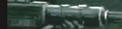
So, another layout update. This time I corrected some spelling mistakes on the custom navigation bar and fixed some issues with the alignment of the images.The problem is that when you are chopping up the larger image in order to assign a link to each smaller image, even if you are one pixel off it can have a major impact on the final design. I would like to thank my wife Leah for spending all this time making the graphs for me.
Give me some feedback please and notify me if you find any issues. If anyone is interested in my template I can give them my code provided they have their own graphs. Keep in mind there is still a lot of work even with the code ready (mainly chopping up the images and uploading them on the net) but I could explain it step by step to anyone who asks.


Antipope,
ReplyDeleteI keep getting directed to a JPEG when I hit any of your little "tabs", rather than the area they are intended to go.
I do like the "light up" effect, but I'm sorry to report the links are not effective yet.
Good news!
ReplyDeleteEverything appears to work as it was intended to. Congratulations on the new layout.
I love tinkering with the layout and features of my blog, it's one of life's little pleasures eh?
@ Loquacious: This is very strange. I've tested it in IE, FF and Chrome and the links work fine for me. What browser are you using? Thanks for the feedback.
ReplyDelete@ GDMNW: Cheers. DIY coding has become a sort of hobby of mine. When I realised I had to pay a web designer 200 euros to "beautify" my bands Myspace profile I thought I could try and do it on my own. I mean, if a code monkey could do it then I should be able to do so as well :P Glad you like the new layout.
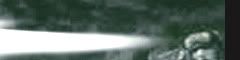
Everything is fine and I must say that I really like how you fixed the mismatching graphic of the lasgun flare. One thing I noticed although not a problem but something strange. It seems to be a tiny 122nd Cadian logo on the left side of the banner that links to the homepage. Was this intended to be there?
ReplyDeleteI found the problem... it was a silly user error... I was clicking inside the post on your template JPEG rather than the actual tabs & banner at the top. D'OH! Sorry for the confusion.
ReplyDeleteLooks great now that I'm doing it right =p
@ Mihalis: Danke. It was down to Leah making a very precise job cutting down all the images correctly. Hard work indeed!
ReplyDeleteAlso you have a keen eye. Yes the small 122nd Cadian letters is the Blog Title. Since I am not substituting if for an image like most people (the custom tab is a separate div) it has to stay there. I could hide it behind the div but it is considered a black hat practise by search engines so I'd rather not. Can you suggest a solution?
@ Loquacious: Haha, phew! And I thought I might have some issues with certain browsers. Glad you like it now, tell me if it is easy enough to navigate. Thanks.
I thought that it would be there for this reason.In that case you can't do many things other than leaving it as it is, in many cases you can blend the colour of the text with the color of the background but here its a little bit difficult since the background is a pic. Maybe you could use a darker color only for this, a black or a dark grey just to make it dissapear a little more.
ReplyDeleteAll the buttons work fine for me, though speaking of the colours the text at the bottom is a bit hard to read with the white of the background image.
ReplyDeleteMaybe give it a black outline around the text or something?
Either way, not a huge issue and it looks very nice :)
Hey, cheers. For which text are you refering to? The one on the custom nav bar?
ReplyDeleteI always say that a little eyeball bleeding never hurt anyone :P
The one that seems to bug me the most is 'Fluff', with the white blob under it.
ReplyDeleteNot the end of the world though.